Friday, 3 December 2010

Analysis Of Kerrang Magazine Contents Pages


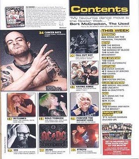
This is the contents page of Kerrang magazine. There are many images used for attraction around the page. They have been constructed in a appropriate manner, so that they are easy to look out (not blurry) and are layed out well next to each other instead of being placed in random places. They support the style of the magazine well as the images of the people have tattoo's and various different coloured hair, suggesting the Rock genre using the stereotypical person who would have a interest in Rock. There are 9 images around the page.

The colours used are white/red/ yellow/black. A added colour from the front cover, yellow. The other 3 colours support the style of the front cover as they are the same colours. The fonts are once again plain/simple but using capitals and bold effect.


The information is 0rganised in stanza's. In a column going down the page on the right, next to the images. This makes is very accesssible to the audience, as it is very easy to read. There a section that says 'This Week'. This tells us that the magazine hasn't created confusing sections and has made very easy to understand, showing the audience the news from bands of this week.
The magazine logo isn't on the page but there is a small image of the front cover in the left corner which holds the title block, showing what magazine this contents page belongs to.

Thursday, 2 December 2010

Analysis Of Q Magazine Contents Pages


This is the contents page for Q Magazine. The magazine uses many images to attract the reader. The images have been layed out appropriately for a contents page, they are spread around well. The images support my initial ideas about the style of Rock genre from the celebrities outfits, body positions and facial expressions. Some of the images have been rotated and have a white borderline to look like a real-life picture. All together there are eleven images used for the contents, revealing what is inside. Images are a great way to attract towards the information, if the audience see a celebrity they like they will read the page number and about the page.
The main bold colour is Red, which stands out and symbolizes rock well. White and black is used to create a modern effect to the images, matching Cheryl Cole's bold image which is also in black and white. Also mostly all the images have either black, red or white in it supporting the background and text. These three colours support the style of the front cover well as the same colours are used, which links both pages in a good way, which proves a house style has been developed through colours.
The information is organised in a good matter. It is accessible to the audience as it has been cut up into two groups 'Regular' and 'Features'. Doing this makes it much easier for the reader to understand what pages are where. It tells the audience what is inside the magazine. After the two sections the page titles and numbers are set out in paragraphs in a column.
The magazine logo 'Q' is placed in the bottom corner of both pages and obviously is used in the Title to show what magazine it is linked to. It is a quite dominant but where it is only a small logo in a hard place to spot it will not catch the audiences eye straight away.


Analysis Of Kerrang Magazine Front Cover

This is a front cover from Kerrang Music Magazine. It is a rock music genre magazine. From this front cover you can see that there will be feature articles in the mag, and also a main article based on 30 Seconds to Mars. I know this because of the central image is Jared Leto, the lead singer from the band. The target audience would be of the male or female gender, but maybe mostly males as 30 Seconds to Mars are a masculine band. This magazine will only appeal to those who have a interest in Rock music, and also have an attraction to the bands on the front cover. The age group will have quite a big age group. From teenagers (13/14) to adults (30).
The main image of Jared Leto has a direct mode of address which attracts the audience well. It shows that the magazine wants a close relationship to the reader, bringing them into the magazine world using direct mode of address. These images are on the front cover to help attract a bigger audience.
The anchorage texts says 'Jared Leto's Dark Side Exposed'. Attracting the audience well by having them want to know what is being exposed, a gossip being used so that the audience feel as if they are close to Jared Leto and know him well. Jared Leto has a daring body position matching his anchorage text. He's hands are clenched together using fists showing that he does have a dark side to expose.
Buzz words like 'PLUS' attract the readers eye well, especially using a bold red rectangle to help it stand out. It catches the audience's eye to read what is inside the magazine, and then if they see something that they are interested in it will sell easier. 'Meet Alice in Chains' another puff used in a red star.
The design of the title block 'KERRANG!' helps notice easily that this is a Rock magazine. Using white coloured font on a black background works well. The cracks in the font suggest broken glass. Obviously this title stands out very well, as it is very big and bold. The main colours used for this front cover of Kerrang are red/white/black, a good colour scheme to use for the Rock genre. They are attractive, stand out and contrast well with the black leather jacket and black hair from Jared Leto. Plain fonts are used, making it extremely easy for the audience to read, but in Capitals and in a bold effect helping it stand out very well and look more decorative.

Wednesday, 1 December 2010

Analysis Of Q Magazine Front Cover


Q Magazine is Indie/Rock. From the colour scheme; black/red/white, it gives away the idea of rock. From this front cover the audience automatically understand that the main article will be based on Cheryl Cole, as she is the main image. The target audience for this Q Magazine would be both genders that are fascinated by Cheryl Cole, and those who like the music genre rock. Cheryl Cole appeals to both females and males as she is could be an icon to women and men are attracted by her appearance. The particular age group however would be adults or older teenagers as they would understand the vocabulary easier than younger people.
The image used of Cheryl Cole is a direct mode of address, it tells us that the type of relationship this magazine is asking for is a close relationship so that the audience is attracted easier, and so that they feel like part of this magazine world as Cheryl Cole is inviting them in. 
The anchorage text says '3 words CHERYL COLE ROCKS'. This gives a very positive attitude on the artist as 'ROCKS' could mean she is great in teenage slang. But could also mean she has joined the rock genre or used a rock instrument which connects with the magazine. The part '3 words' is what the audience already know, as this is one of her songs. The overall message that Cheryl Cole is giving to the audience is quite provacative as she wears bright red lipstick (contrasting with the colours on the magazine, the title etc) with her tounge out touching a blade which makes her look strong towards the audience.
Other artists that are being spoken about are White Stripes/John Lennon/U2. Which are completely different than Cheryl Cole, this groups actually suit the music genre of the magazine whereas Cheryl Cole is challenging the stereotype, bringing R n B into the magazine. This groups are in much smaller writing than Cheryl Cole's writing.
The title of this magazine is 'Q'. The title block is short and sweet (basic font is used) in the colour white on a red background, so that it stands out to the audience well, also red usually works well with the rock music genre so it gives the audience an idea of what music genre the magazine is. The puffs around the sides (text boxes and circles) tell the audience what will be in the magazine, helping the audience so that its much easier to tell if the magazine is an interest to them or not. The slogan at the top of the page 'THE UK'S BIGGEST MUSIC MAGAZINE' attracts the reader extremely well as the reader will think that alot of people read this magazine, and thats its the 'biggest music magazine' making the reader think that its a very good magazine compared to other music magazines, that its the best.
Overall the magazine is very attractive to the human eye which helps sell alot.

Monday, 11 October 2010

My Magazine Article So Far

Today I am sitting in New York, with new Rock Band ‘Burning Dreams’ to talk about how each member began. The atmosphere is ELECTRIC! and everyone seems extremely smiley about their work. Lead member and lead guitar player, Billy Hamlyn talks about how he began he’s electrifying journey to Rocking it out! Billy started his ride to fame just over a year ago, when he was noticed by a music industry named Giant Records (Warner). ‘I started playing the drums when I was seven years old. I used to drive my sister mad banging it in my room. With my Rock music blasting the ceilings!’ Billy Hamlyn had then started learning how to play the electric guitar when he was ten, and when he turned twelve his sister bought him a gorgeous electric guitar and the amplifier (with the help of their parents of course). His younger sister Daisy Hamlyn (Lead Vocals) was only seven at the time and by then she loved singing along to his music. ‘I loveee karaoke!’ She tells us ‘At times like Christmas, I would grab the mic and not let it go!’ Obviously this was a good sign to start a music band. Billy tells us ‘I got a couple of my mates together who I knew were lovers of rock and just formed a band’. The band tells us the hardest thing to find was a main singer so Billy turned to his younger sister for help. He knew she wasn’t a great sister because of the way she used to mess around, but at this point Daisy was thirteen and pretty damn confident. They held her an audition to see what Daisy could really do, and it turned out she could hit all the right notes perfectly. ‘I found it weird at the beginning working with all boys, and not to mention my older, extremely overprotective brother! But after a while I started to accept it. My inspirational Rock Band would be Paramore. Obviously Hayley Williams is the main singer, and the only girl. So she’s a great example to me’ Daisy says.
All members of the Band attended a school in London (England, which is where all the bar members were born and brought up) called Bishop Challoner. Clearly it was hard to practice because they were in separated schools, boys and girls but they worked out a time scheme. The school had great musical instruments, equipment and a high-quality studio for recording. ‘We would practice every Monday, Wednesday and even give up our party night Friday! Just so we know we are practicing to perfection’ Drummer Zack Thomas informs us. The school were kind enough to invite the band to show nights and performances that they could take part of. ‘This helped us to build our confidence in front of big crowds and also get us used to performing’ Bass guitar player Christopher Smith tells us. Their first performance was January 2006, which was a talent show held in Bishop Challoner School. They sang a song called ‘Complicated’ by Avril Lavigne and also a song that guitar player Liam Fusty wrote himself called ‘Raining Fire’. Obviously the members of the band were quite young back in 2006 so the songs they wrote weren’t as great as the ones they write now. It must’ve been great winning the first ever Talent show, which they did.
After the Talent show ‘Burning Dreams’ tells us that their confidence grew fairly big. Visibly Daisy’s voice has grown to become much stronger as she grows up, and all the guitar players can hit harder chords and the drummer has stronger arms, so there songs are becoming much more intermediate than four years ago. In 2008 they were asked to perform in the West End, Oxford Circus in England.

Friday, 1 October 2010

Preliminary College Magazine Front Cover

My Bishop Challoner magazine cover.
I designed this image in Adobe Photoshop. The image is originally in colour but I adjusted the contrast to black and white, and made the white part more brighter so that the subject stands out. I used this image so that the audience can tell that Bishop has good security, using camera's. The subject is pointing at the audience with a direct mode of address to tell them Bishop Challoner is watching them. I then placed the image onto Adobe Illustrator so that words and puffs can be inserted. The first thing I did was thought of a Title to the magazine to match the image.I used a colour scheme of reds/yellows/oranges to bring out some colour on the black and white image. I used puffs (circles and rectangles) to write on what will be inside the magazine. The rectangles have a gradient of black fading to white to match the image.

Preliminary College Magazine Contents Page

My Bishop Challoner magazine contents page.
I designed this image in Adobe Photoshop. I have adjusted the images brightness and contrast so that the main colour orange stands out, and contrasts with the title. I used this image as the subject is smiling and looks happy, which gives a good view on Bishop Challoner school. It is the same girl as the front cover in the same outfit, which helps the main storyline. The image is a direct mode of address that helps attract the audience to the page. I then placed this image onto Adobe Illustrator so that I could insert the Title and the contents information. I put the Title from the front cover at the bottom of this page to show that this is from the same magazine. I used colours such as oranges, blacks and whites on this page to match the image. Also that is the colour scheme from the front cover. I then used the same font as the main title for the word 'Contents' (which is the title of this page). Then I inserted text boxes showing page numbers and the information that is held on them pages so that the audience understand what page has what.