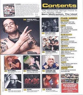
This is the contents page of Kerrang magazine. There are many images used for attraction around the page. They have been constructed in a appropriate manner, so that they are easy to look out (not blurry) and are layed out well next to each other instead of being placed in random places. They support the style of the magazine well as the images of the people have tattoo's and various different coloured hair, suggesting the Rock genre using the stereotypical person who would have a interest in Rock. There are 9 images around the page.
The colours used are white/red/ yellow/black. A added colour from the front cover, yellow. The other 3 colours support the style of the front cover as they are the same colours. The fonts are once again plain/simple but using capitals and bold effect.
The information is 0rganised in stanza's. In a column going down the page on the right, next to the images. This makes is very accesssible to the audience, as it is very easy to read. There a section that says 'This Week'. This tells us that the magazine hasn't created confusing sections and has made very easy to understand, showing the audience the news from bands of this week.
The magazine logo isn't on the page but there is a small image of the front cover in the left corner which holds the title block, showing what magazine this contents page belongs to.

No comments:
Post a Comment