Saturday, 4 December 2010

Analysis Of Kerrang Magazine Article

1) What does the choice of artist featured in the article suggest who the target audience will be?
2) What type of language is used in the article? Is the language used informal or does it have a more academic quality? How does this language appeal to the audience? Give examples of words or phrases which are specific to the style of the magazine.
3) What tone does the magazine use to address the reader (as a close friend, a member of an 'in' crowd or an informed intelligent fan?) - provide evidence
4) What style of text is used? Is it similar to any other pages? What does it say about the image of the magazine and the audience? How is the text arranged? How is the interview laid out? Are various entry points used and why?
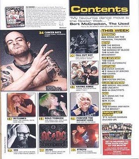
5) How are the pages laid out? How much of the pages are taken up by images and how much by text? How does this reflect the audience? What do they value?
6) What tone is the magazine using when addressing the reader (as a close friend, a member of an 'in' crowd or an informed intelligent fan?) - provide evidence
7) How is the artist/band presented to the audience through the images? How is meaning achored through the caption? You may wish to carry out a textual analysis.
8) How does the style of the article match the style of the front cover? Is a house style being developed across all the pages you have analysed?
9) Does the article demand any prior knowledge? Give examples.

Friday, 3 December 2010

Analysis Of Q Magazine Article

The artist featured in this article is ‘Cheryl Cole’ to suggest that the target audience would be a middle class view of both genders and different ages. Mostly adults as men would find Cheryl Cole attractive and women that use her as an icon to themselves. The study of sign and semiotics is like an observer so it is informal language that is used in this article. This type of language appeals to the audience well as it gives an inside view of what Cheryl Cole feels about fame. The opening sentence ‘Cheryl Cole is sick to death of looking at herself’ is quite a personal quote from Cheryl. She is telling the reader how she really feels about her new image as a pop sensation. She doesn’t seem to love the new make-up and hair extensions etc. The semiotic tone that the magazine uses to address the reader is as an observer. Quite personal information used from Cheryl Cole and friends.
The tone that the magazine gives out would be as a close friend, like a gossip from Cheryl Cole. Revealing how she feels to the audience will make them feel like they know her more well. The text is easy to read, using a simple font. It is set out in 3 columns, similar to the Contents page as columns are easy to understand.The colours red, white and black are used again to link the the front cover and the contents page. The artist is represented in a positive way, nice appearance but also the dark, black lighting used for the image link back to a Rock theme, which works well with the genre of this magazine.

Analysis Of Kerrang Magazine Contents Pages


This is the contents page of Kerrang magazine. There are many images used for attraction around the page. They have been constructed in a appropriate manner, so that they are easy to look out (not blurry) and are layed out well next to each other instead of being placed in random places. They support the style of the magazine well as the images of the people have tattoo's and various different coloured hair, suggesting the Rock genre using the stereotypical person who would have a interest in Rock. There are 9 images around the page.

The colours used are white/red/ yellow/black. A added colour from the front cover, yellow. The other 3 colours support the style of the front cover as they are the same colours. The fonts are once again plain/simple but using capitals and bold effect.


The information is 0rganised in stanza's. In a column going down the page on the right, next to the images. This makes is very accesssible to the audience, as it is very easy to read. There a section that says 'This Week'. This tells us that the magazine hasn't created confusing sections and has made very easy to understand, showing the audience the news from bands of this week.
The magazine logo isn't on the page but there is a small image of the front cover in the left corner which holds the title block, showing what magazine this contents page belongs to.

Thursday, 2 December 2010

Analysis Of Q Magazine Contents Pages


This is the contents page for Q Magazine. The magazine uses many images to attract the reader. The images have been layed out appropriately for a contents page, they are spread around well. The images support my initial ideas about the style of Rock genre from the celebrities outfits, body positions and facial expressions. Some of the images have been rotated and have a white borderline to look like a real-life picture. All together there are eleven images used for the contents, revealing what is inside. Images are a great way to attract towards the information, if the audience see a celebrity they like they will read the page number and about the page.
The main bold colour is Red, which stands out and symbolizes rock well. White and black is used to create a modern effect to the images, matching Cheryl Cole's bold image which is also in black and white. Also mostly all the images have either black, red or white in it supporting the background and text. These three colours support the style of the front cover well as the same colours are used, which links both pages in a good way, which proves a house style has been developed through colours.
The information is organised in a good matter. It is accessible to the audience as it has been cut up into two groups 'Regular' and 'Features'. Doing this makes it much easier for the reader to understand what pages are where. It tells the audience what is inside the magazine. After the two sections the page titles and numbers are set out in paragraphs in a column.
The magazine logo 'Q' is placed in the bottom corner of both pages and obviously is used in the Title to show what magazine it is linked to. It is a quite dominant but where it is only a small logo in a hard place to spot it will not catch the audiences eye straight away.


Analysis Of Kerrang Magazine Front Cover

This is a front cover from Kerrang Music Magazine. It is a rock music genre magazine. From this front cover you can see that there will be feature articles in the mag, and also a main article based on 30 Seconds to Mars. I know this because of the central image is Jared Leto, the lead singer from the band. The target audience would be of the male or female gender, but maybe mostly males as 30 Seconds to Mars are a masculine band. This magazine will only appeal to those who have a interest in Rock music, and also have an attraction to the bands on the front cover. The age group will have quite a big age group. From teenagers (13/14) to adults (30).
The main image of Jared Leto has a direct mode of address which attracts the audience well. It shows that the magazine wants a close relationship to the reader, bringing them into the magazine world using direct mode of address. These images are on the front cover to help attract a bigger audience.
The anchorage texts says 'Jared Leto's Dark Side Exposed'. Attracting the audience well by having them want to know what is being exposed, a gossip being used so that the audience feel as if they are close to Jared Leto and know him well. Jared Leto has a daring body position matching his anchorage text. He's hands are clenched together using fists showing that he does have a dark side to expose.
Buzz words like 'PLUS' attract the readers eye well, especially using a bold red rectangle to help it stand out. It catches the audience's eye to read what is inside the magazine, and then if they see something that they are interested in it will sell easier. 'Meet Alice in Chains' another puff used in a red star.
The design of the title block 'KERRANG!' helps notice easily that this is a Rock magazine. Using white coloured font on a black background works well. The cracks in the font suggest broken glass. Obviously this title stands out very well, as it is very big and bold. The main colours used for this front cover of Kerrang are red/white/black, a good colour scheme to use for the Rock genre. They are attractive, stand out and contrast well with the black leather jacket and black hair from Jared Leto. Plain fonts are used, making it extremely easy for the audience to read, but in Capitals and in a bold effect helping it stand out very well and look more decorative.

Wednesday, 1 December 2010

Analysis Of Q Magazine Front Cover


Q Magazine is Indie/Rock. From the colour scheme; black/red/white, it gives away the idea of rock. From this front cover the audience automatically understand that the main article will be based on Cheryl Cole, as she is the main image. The target audience for this Q Magazine would be both genders that are fascinated by Cheryl Cole, and those who like the music genre rock. Cheryl Cole appeals to both females and males as she is could be an icon to women and men are attracted by her appearance. The particular age group however would be adults or older teenagers as they would understand the vocabulary easier than younger people.
The image used of Cheryl Cole is a direct mode of address, it tells us that the type of relationship this magazine is asking for is a close relationship so that the audience is attracted easier, and so that they feel like part of this magazine world as Cheryl Cole is inviting them in. 
The anchorage text says '3 words CHERYL COLE ROCKS'. This gives a very positive attitude on the artist as 'ROCKS' could mean she is great in teenage slang. But could also mean she has joined the rock genre or used a rock instrument which connects with the magazine. The part '3 words' is what the audience already know, as this is one of her songs. The overall message that Cheryl Cole is giving to the audience is quite provacative as she wears bright red lipstick (contrasting with the colours on the magazine, the title etc) with her tounge out touching a blade which makes her look strong towards the audience.
Other artists that are being spoken about are White Stripes/John Lennon/U2. Which are completely different than Cheryl Cole, this groups actually suit the music genre of the magazine whereas Cheryl Cole is challenging the stereotype, bringing R n B into the magazine. This groups are in much smaller writing than Cheryl Cole's writing.
The title of this magazine is 'Q'. The title block is short and sweet (basic font is used) in the colour white on a red background, so that it stands out to the audience well, also red usually works well with the rock music genre so it gives the audience an idea of what music genre the magazine is. The puffs around the sides (text boxes and circles) tell the audience what will be in the magazine, helping the audience so that its much easier to tell if the magazine is an interest to them or not. The slogan at the top of the page 'THE UK'S BIGGEST MUSIC MAGAZINE' attracts the reader extremely well as the reader will think that alot of people read this magazine, and thats its the 'biggest music magazine' making the reader think that its a very good magazine compared to other music magazines, that its the best.
Overall the magazine is very attractive to the human eye which helps sell alot.